Case Study: Training on Demand
Marketing needs something better to market
Training on Demand
Project Requirements
Based on internal goals and customer feedback, the project required:
- A modernized, responsive design consistent with current design standards.
- Full mobile accessibility, eliminating the limitations of the previous non-app experience.
- Enhanced usability for training coordinators, particularly in student management and training point ordering.
- Streamlined navigation and improved user transparency.
- Visual updates that maintained brand identity while improving accessibility.
Project Overview
The existing Online Training platform was outdated in both appearance and functionality. Its legacy design hindered usability, especially on mobile devices, and did not reflect the brand’s commitment to innovation and accessibility. The redesign effort began with a focus on the administration portion of the platform used by training coordinators, laying the foundation for subsequent updates across the broader system.
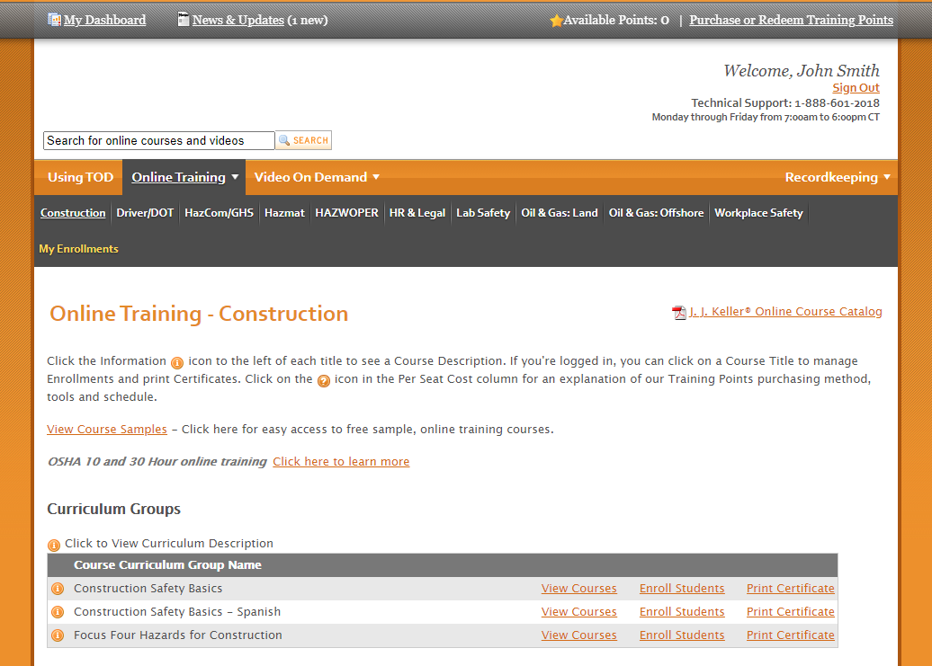
Original Design

The Challenge
The primary challenge was to redesign the platform in a way that improved usability and visual appeal without disrupting the core functionality relied upon by existing users. Additionally, the lack of a responsive mobile experience significantly limited user access, creating a need to prioritize mobile-first design principles.
The Approach & Solution
To understand user needs, the team conducted customer surveys and reviewed tech support feedback. While responses varied, recurring themes included the need to:
- Simplify student management workflows.
- Improve the ordering process for training points.
- Create a more intuitive and transparent navigation structure.
- Update visuals while enhancing accessibility.
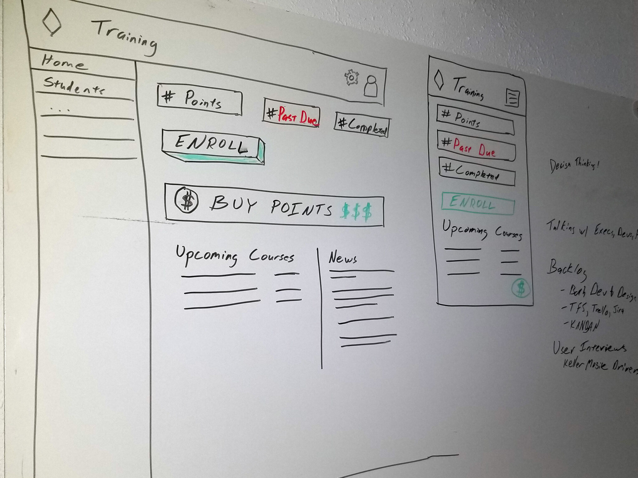
- Collaborative design sessions, including whiteboarding and cross-department brainstorming, fostered broad organizational input. This inclusive process strengthened corporate alignment and ensured the final product addressed real-world use cases.
- The design team preserved brand recognition by continuing to use the signature sunset orange hue strategically for actionable elements like buttons and menu items. Final concepts featured various color schemes, but all adhered to a standardized corporate layout used across other services, ensuring consistency and familiarity for users.
The Results
Through cross-functional collaboration—including stakeholder interviews, customer surveys, co-creation workshops, and iterative prototyping—the redesign of Training on Demand achieved its goal of modernizing the platform while maintaining critical functionality. The final solution introduced a more intuitive administrative experience, responsive design for mobile users, and improved accessibility throughout. With a strong foundation now in place, the team is poised to continue evolving the platform to better serve both training coordinators and learners in an increasingly digital-first environment.
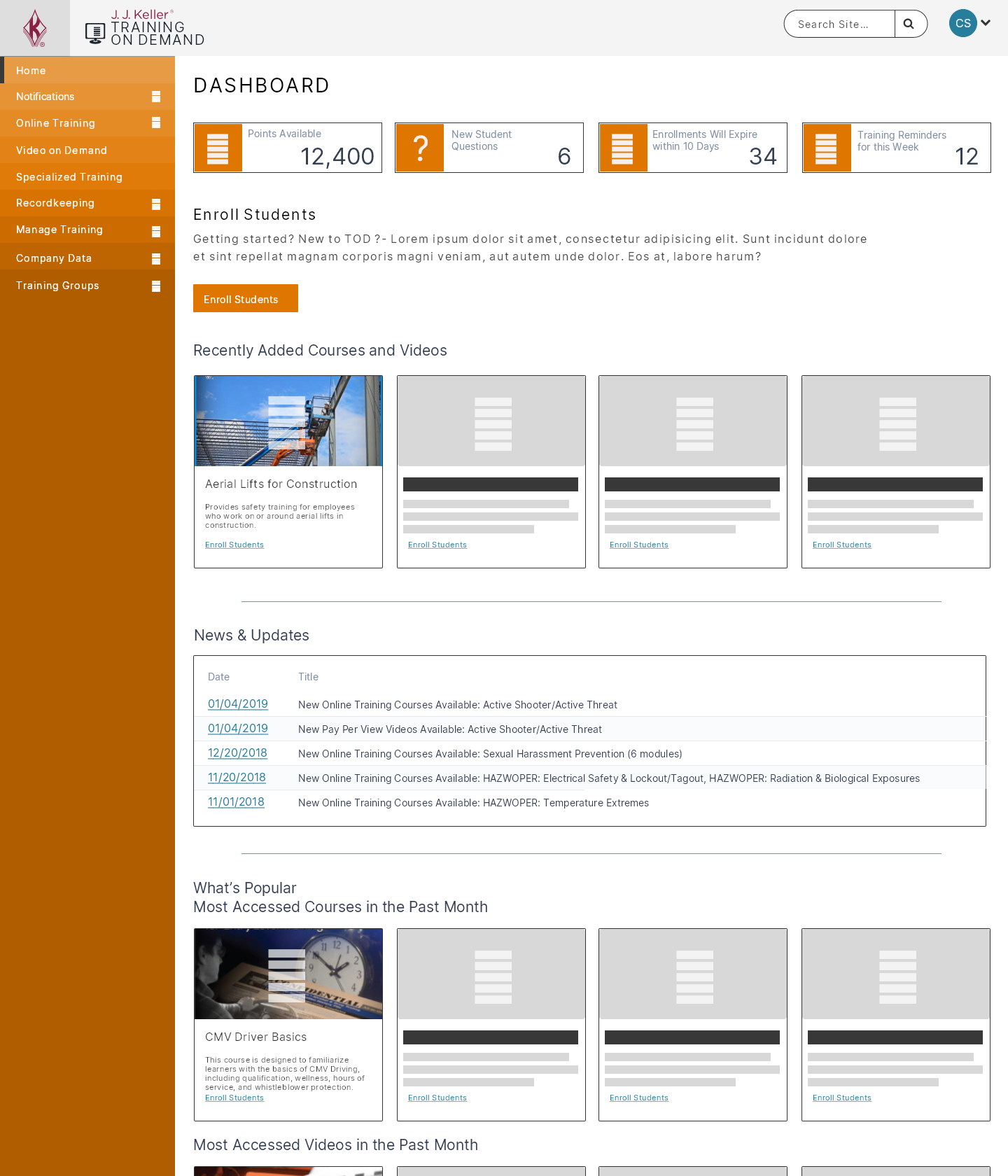
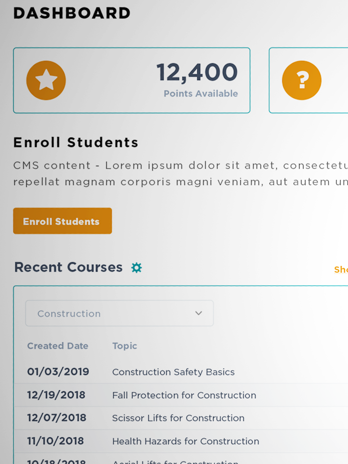
Training on Demand dashboard
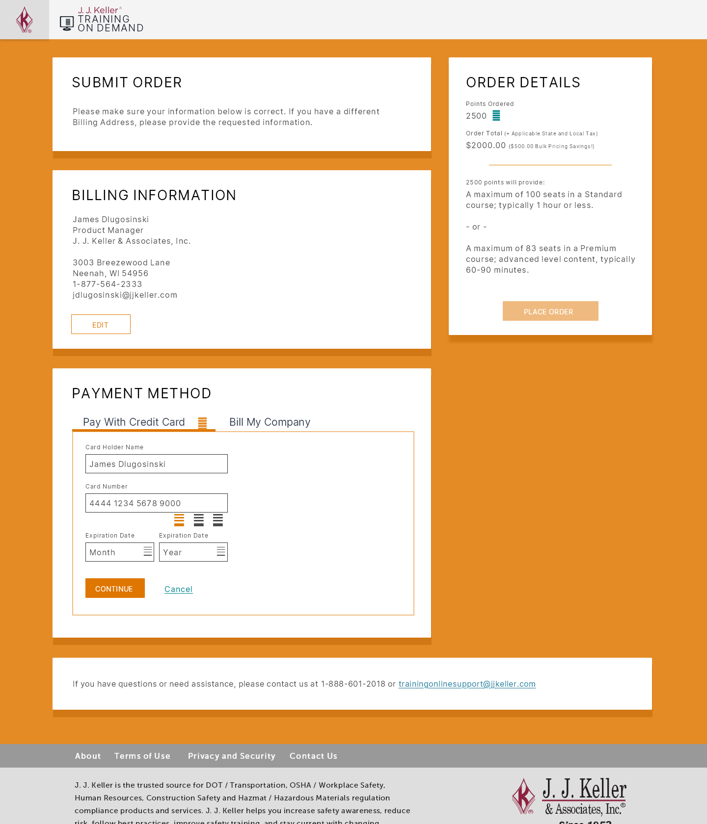
Training on Demand Payment Process
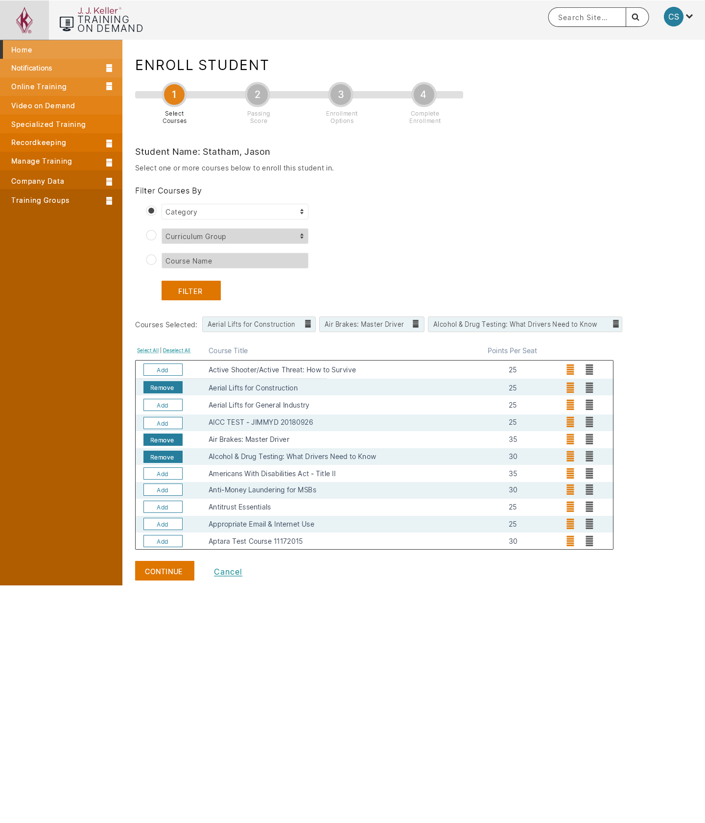
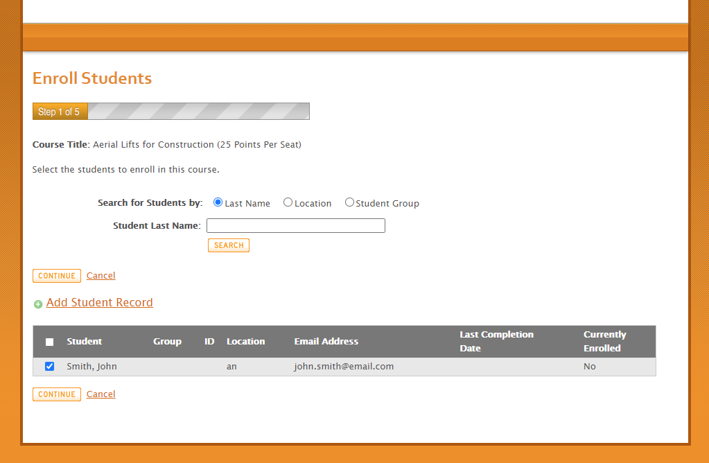
Training on Demand Enrollment
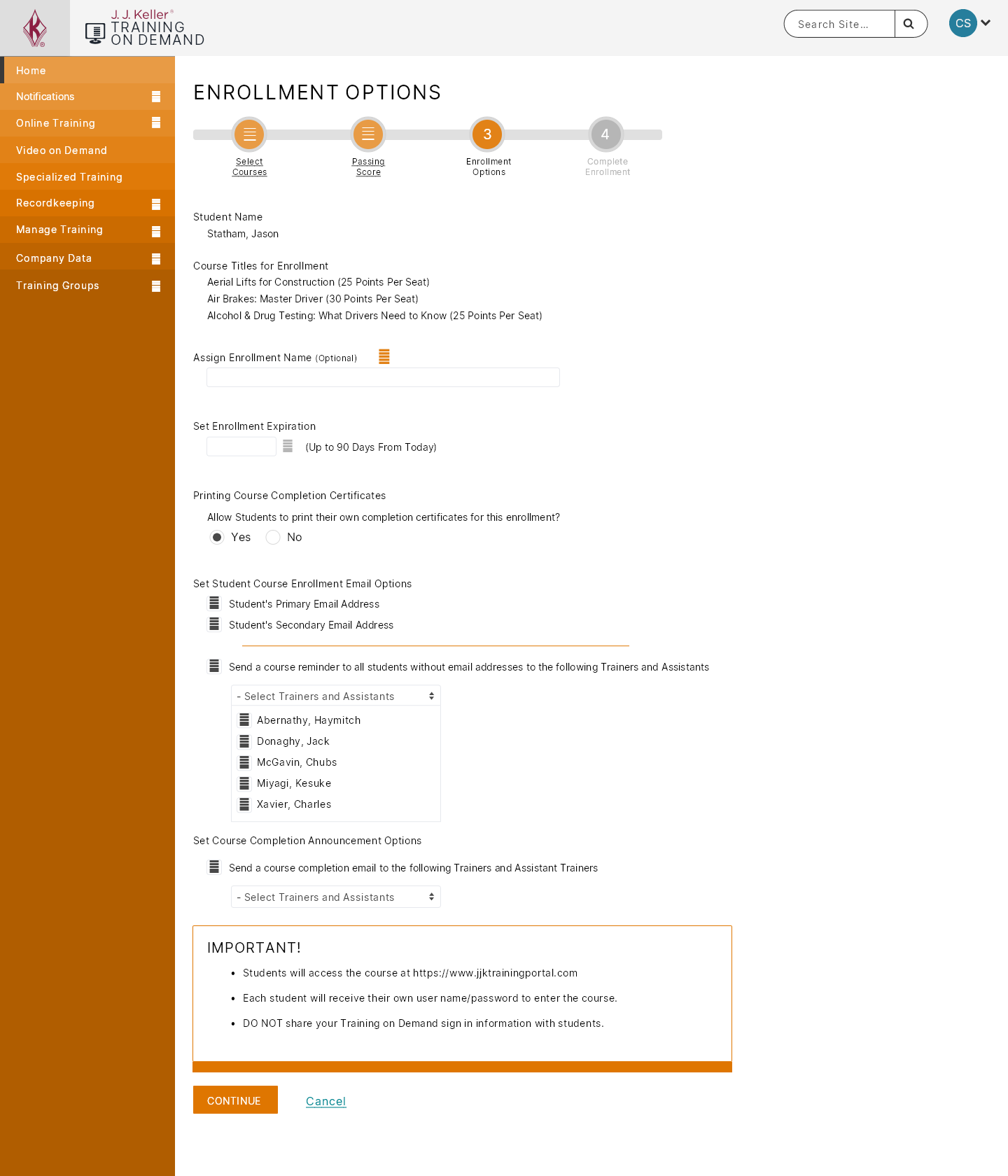
Training on Demand Enrollment Step 3
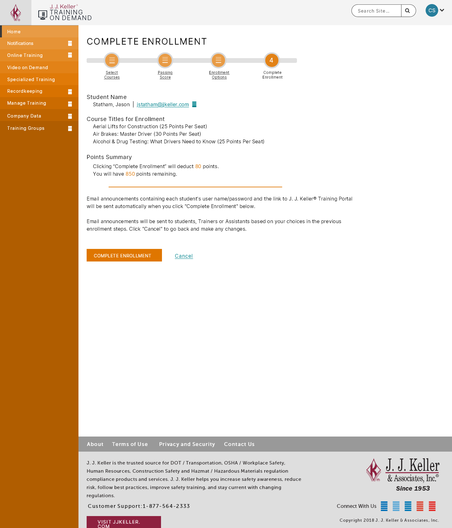
Training on Demand Enrollment Complete
Client Testimonial
COMPLETELY USER FRIENDLY! Set up a course for my driver to take. He took it the very same day with no problems at all! Excellent site & tutorials.