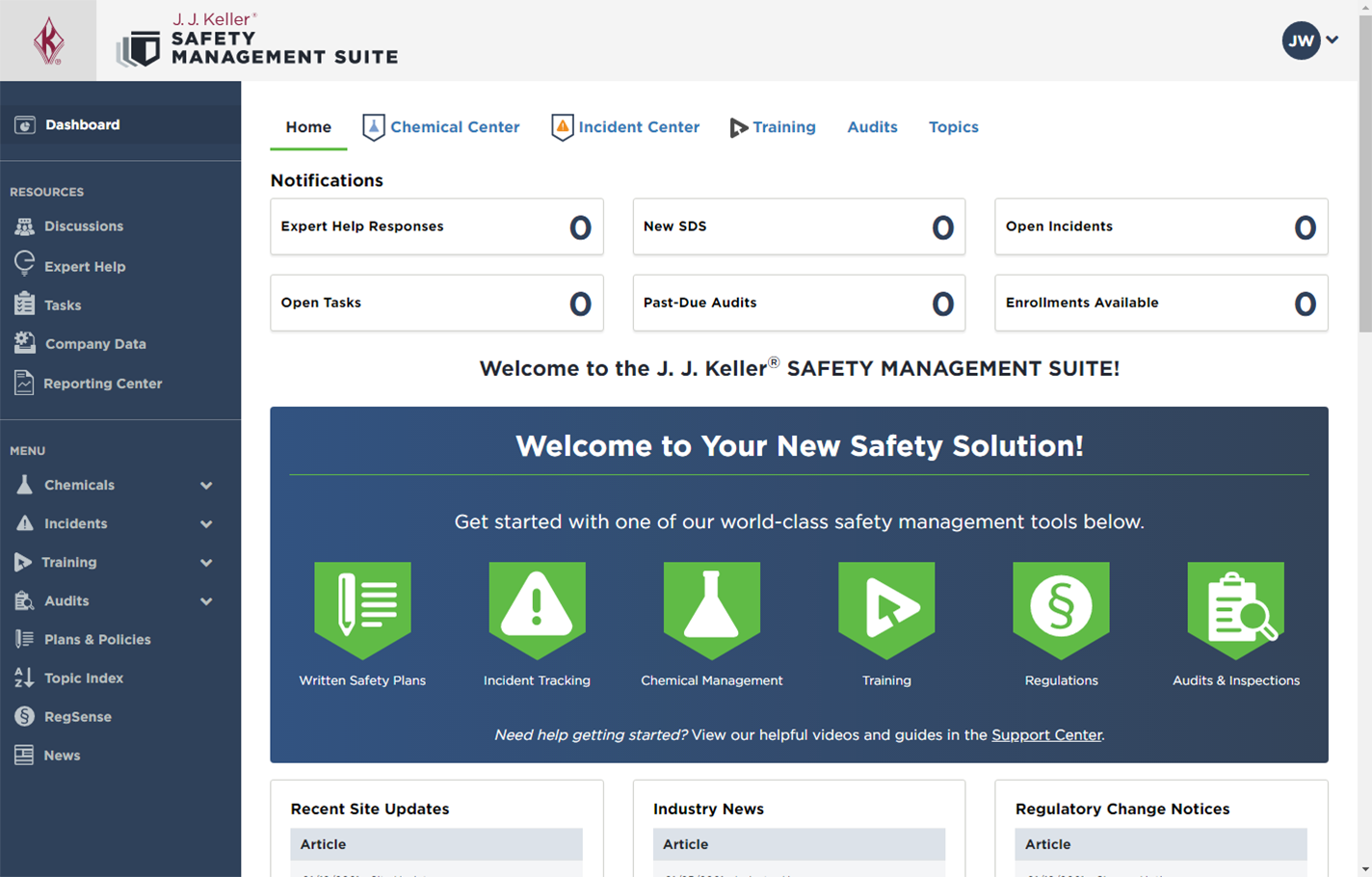
Safety Management Suite
Modernizing a 20-year-old workplace safety platform used by 20,000+ subscribers.
I led the UX strategy, navigation redesign, and modernization of key tools, delivering a more intuitive, efficient, and mobile-responsive experience.

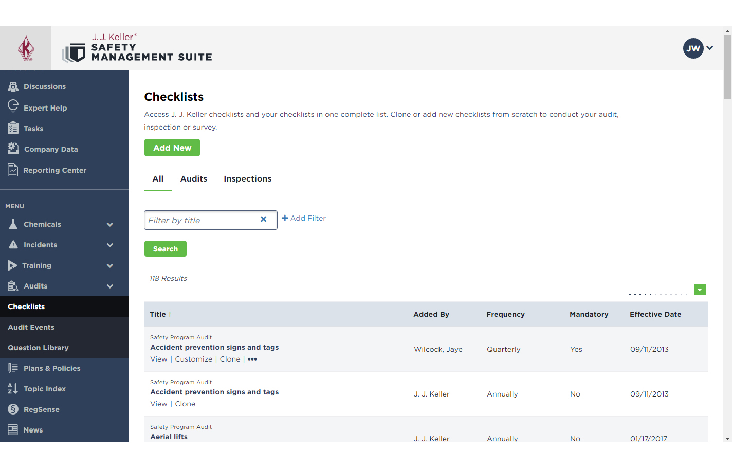
Monitoring Checklist Overview
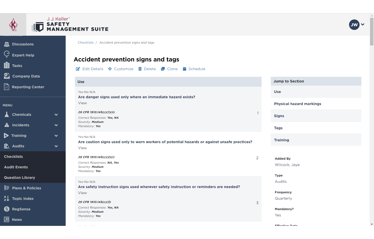
Monitoring Checklist Builder
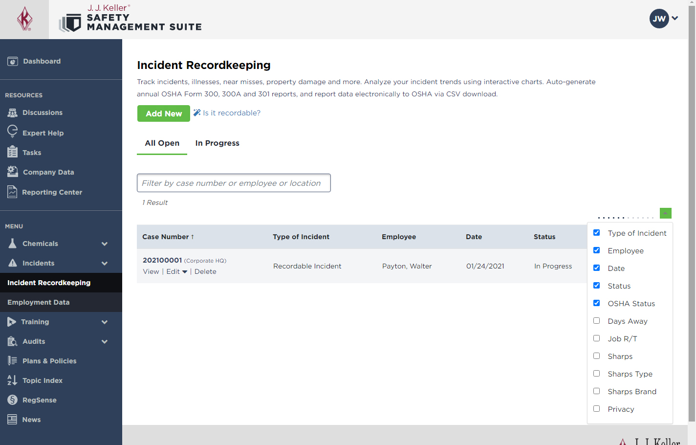
Incident List
Content Library
My Role
UX/UI Designer
Design Lead
Timeline
3 years
Multi-year project
Users
Safety managers, compliance professionals, HR teams
Platform
Responsive web application
My Contributions
- UX strategy & IA
- Navigation redesign
- Wireframing & prototyping
- User testing
The Challenge
Years of feature additions left users with a fragmented, inefficient experience.
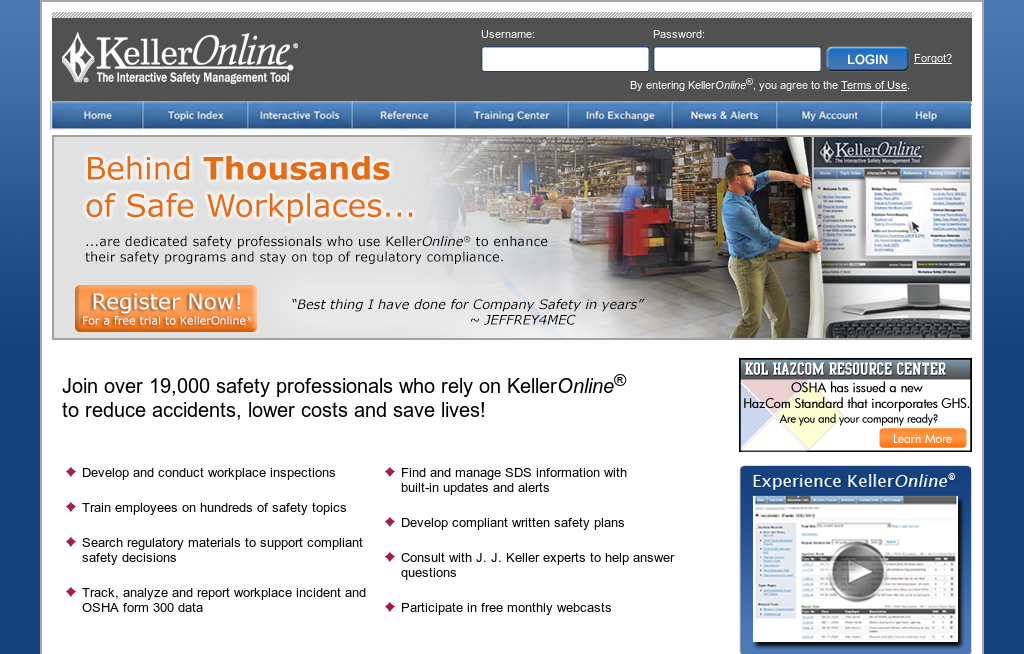
- Cluttered layout
- Inconsistent navigation
- Dense information hierarchy
- Desktop-only experience
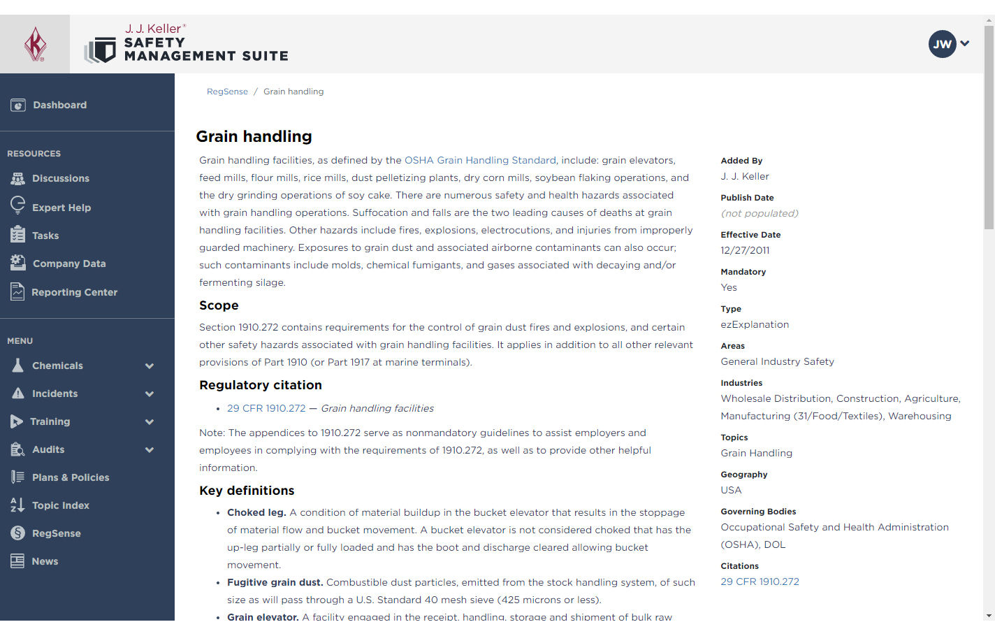
- Simplified, predictable navigation
- Clear information hierarchy
- Modern, mobile-responsive design
- Faster access to critical tools
The Approach
1. Discover
Stakeholder interviews, analytics review, and user feedback revealed key pain points.
2. Explore
Multiple navigation structures and IA models were sketched and evaluated.
3. Validate
User testing helped refine the static sidebar and breadcrumb approach.
4. Design
Responsive layouts, modernized data displays, and prototypes were created.
5. Deliver
Collaborated with development teams and iterated based on launch feedback.
A persistent sidebar combined with breadcrumbs provided the best balance of structure, context, and scalability, validated through user testing.
The Results
Users spent around 23% less time completing tasks related to incident tracking and chemical management.
Quarterly satisfaction reports showed a 31% increase compared to the previous design.
A user base that typically renewed increased by 12%.
A multi-year effort from research and design to successful delivery.
Client Testimonial
The layout is user friendly and easy to navigate. It’s a one-stop-shop for injury reporting, Form 300, and SDS management!
Audra Kimbel
Human Resource Manager, Poly Flex Products, Inc.
By simplifying navigation, modernizing data-heavy tools, and validating decisions with users at every step, we delivered a platform that is easier to use, more efficient, and built for the future.