Registry Individual PWA
Modernizing a highly customized legacy licensing platform into a scalable mobile-first experience
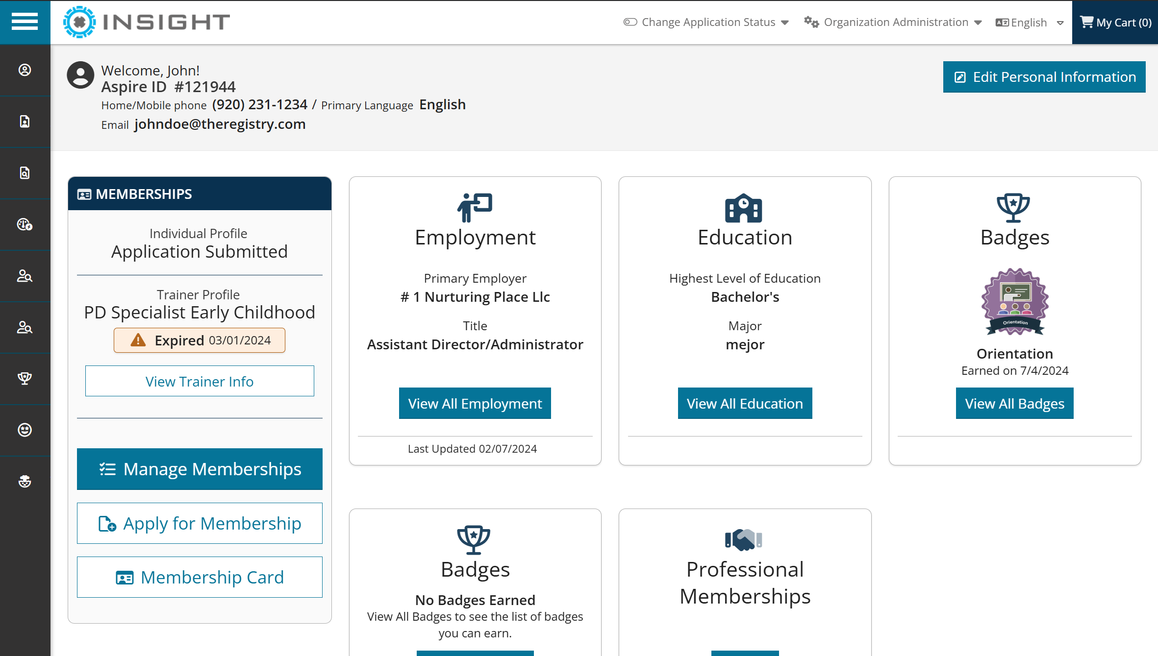
The project transformed a legacy professional development platform into a modern Progressive Web App built for mobile users, administrators, and state-specific workflows. Originally developed with ASP.NET WebForms and Knockout, the application had become difficult to scale due to fragmented workflows and complex logic. The redesign focused on modernizing the platform, improving accessibility, and creating a more scalable, mobile-first experience.

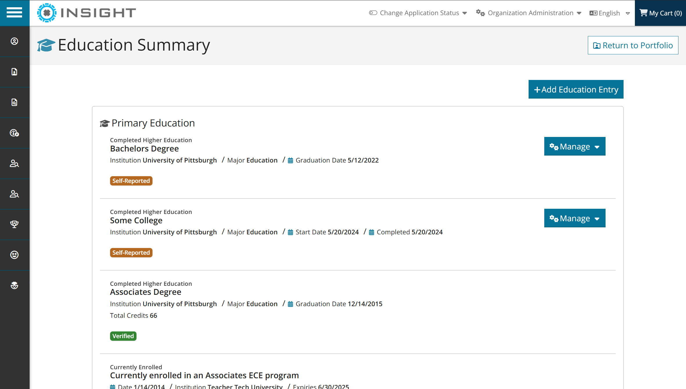
Registry v7 Education
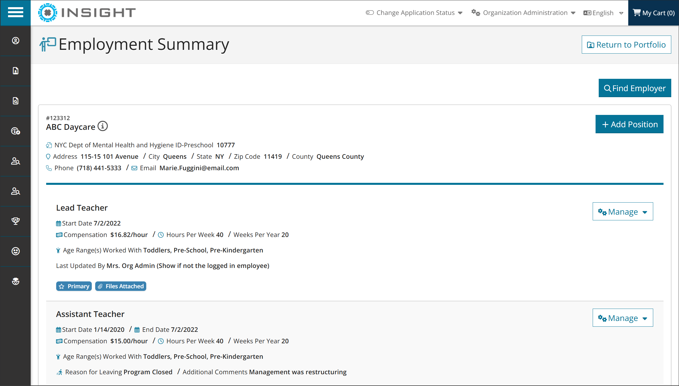
Registry v7 Employment
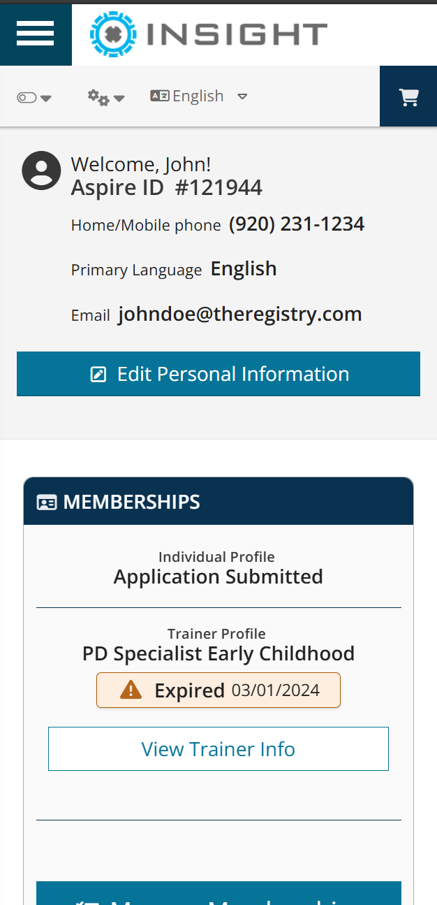
Registry v7 Mobile Profile
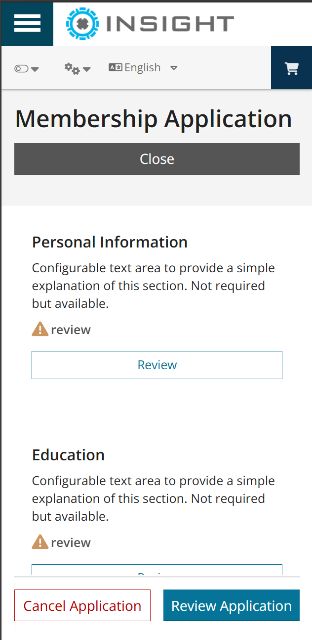
Registry v7 Mobile Application
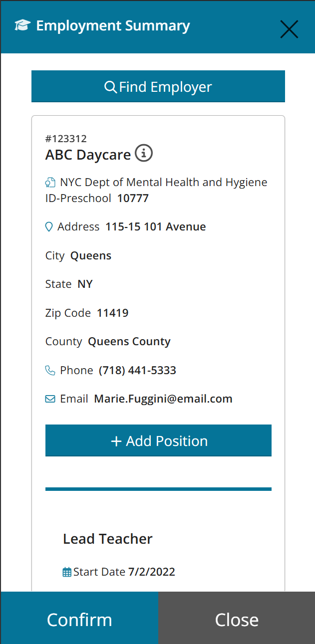
Registry v7 Mobile Employment Summary
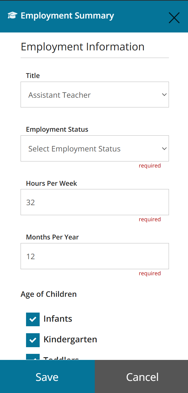
Registry v7 mobile Add Employment
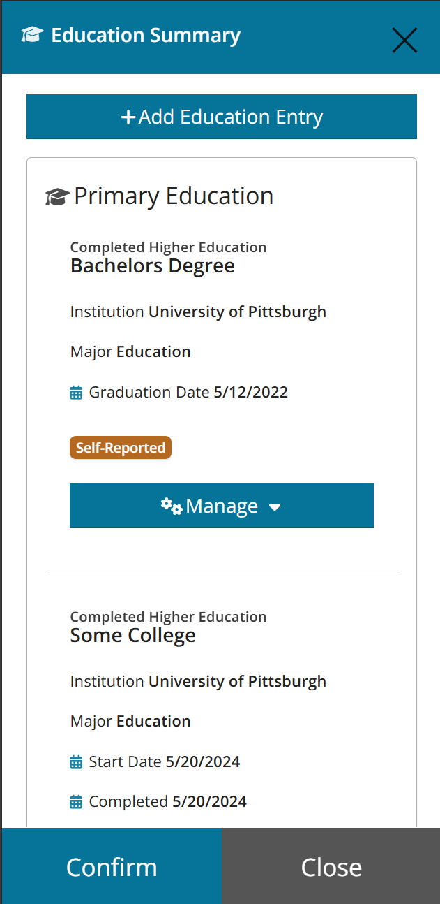
Registry v7 mobile Add Education
My Role
Senior UX/UI Designer
Front-End Developer
Technologies
Flexbox CSS
Angular
TypeScript
Chart.js
Timeline
2+ years
Users
Teachers, childcare providers, administrators, licensing specialists
Platform
Progressive Web Application (PWA)
The Challenge
- Cluttered layout
- Inconsistent navigation
- Dense information hierarchy
- Desktop-only experience
- Simplified, predictable navigation
- Clear information hierarchy
- Modern, mobile-responsive design
- Faster access to critical tools
The Approach
1. Modular Application Flows
Large, rigid forms were broken into smaller, task-focused sections that users could complete progressively. This reduced abandonment and improved completion rates for education, employment, and training workflows.
2. Progressive Disclosures
Complex data-entry sections were reorganized to reveal information only when relevant, reducing visual overload and helping users focus on immediate tasks.
3. Mobile-First Design
The platform was rebuilt using modern flexbox layouts and responsive patterns optimized for mobile usage. Users could now: manage memberships, access QR-coded credentials, update records, and complete workflows directly from mobile devices.
4. PWA Functionality
The application introduced installable app-like behavior including: offline support, push notifications, device installation, and faster navigation performance.
5. Role Separation
Administrative dashboards were redesigned around reporting, compliance tracking, and account management, while end users received simplified profile and credential experiences tailored to their specific needs.
Separate User Experiences Instead of Conditional Interfaces
Previous interface based on user role, created:
- cluttered navigation
- confusing interactions
- significant technical complexity
By designing role-specific workflows:
- simpler interfaces navigation
- improved ux
- development complexity reduced
The Results
Client managers decreased onboarding time by 40%.
Increased mobile usage by 57% after redesign.
Improved accessibility audit compliance
A multi-year effort from research and design to successful delivery.
By restructuring workflows around user intent instead of legacy system constraints, the platform evolved from a fragmented administrative tool into a scalable, mobile-first experience built for long-term growth.